| | New Logo |  |
|
+15Clavius forbidden_moose bret_owen99 Evil Monkey Pope sensorite CrochetOwl CJSchmidt Vicki DoctorOlly SeaDevil Who North America jonwes greenk9 mysterylad Ronpur 19 posters |
|
| Author | Message |
|---|
Ronpur
RANK: The Doctor

Number of posts : 9626
Age : 60
Registration date : 2008-08-29
| | Subject: New Logo Mon Oct 05, 2009 9:02 am | |
| So now that the new series Logo will be revealed at 8 AM, Tuesday London time on the BBC Who page, will WHONA update their logo, or stay the same! The WHONA logo is a combo classic and new who logo anyway. |
|
| | |
mysterylad
RANK: Time Lord Commoner

Number of posts : 1660
Age : 52
Registration date : 2009-02-21
| | Subject: Re: New Logo Mon Oct 05, 2009 12:16 pm | |
| I'd hate to see the WhoNA logo change, since (as you said) it blends the new and classic elements wonderfully, but I am really excited to see the new show logo. |
|
| | |
greenk9
RANK: Time Lord Commoner

Number of posts : 1313
Age : 53
Registration date : 2007-10-20
| | Subject: Re: New Logo Mon Oct 05, 2009 12:56 pm | |
| I hope they go retro- I liked the 70's logo best..sorry I'm an old gal |
|
| | |
Guest
Guest

| | Subject: Re: New Logo Mon Oct 05, 2009 1:43 pm | |
| - Ronpur wrote:
- So now that the new series Logo will be revealed at 8 AM, Tuesday London time on the BBC Who page
For us Americans, that's 3 AM Eastern. So about 13 hours from now. |
|
| | |
jonwes
RANK: Time Lord, Gold Usher

Number of posts : 4627
Registration date : 2007-02-01
| | Subject: Re: New Logo Mon Oct 05, 2009 2:35 pm | |
| No reason to change the WhoNA logo I think. Besides, they have all those tote bags now to sell with that logo, right? Definitely looking forward to seeing what the new logo is like. |
|
| | |
Who North America
RANK: White Guardian

Number of posts : 5792
Registration date : 2007-02-01
| | Subject: Re: New Logo Mon Oct 05, 2009 3:29 pm | |
| No, we will retain the current logo. We like it  |
|
| | |
Guest
Guest
| | Subject: Re: New Logo Tue Oct 06, 2009 3:14 am | |
|  Not too impressed with this new logo, and I'm wondering how it'll lend itself to figure packaging. I hope to god the Giant DW in the shape of the TARDIS won't wind up being the backing card design for the figures. It looks seriously cheesy. |
|
| | |
mysterylad
RANK: Time Lord Commoner
Number of posts : 1660
Age : 52
Registration date : 2009-02-21
| | Subject: Re: New Logo Tue Oct 06, 2009 9:01 am | |
| I don't care for the DW, but I like the rest. |
|
| | |
SeaDevil
RANK: Keeper of Traken
Number of posts : 7003
Age : 57
Registration date : 2009-08-11
| | Subject: Re: New Logo Tue Oct 06, 2009 9:42 am | |
| Not impressed, but I'm sure I'll get used to it and it'll be ok. Still better than the McCoy logo. |
|
| | |
DoctorOlly
RANK: Prime Minister

Number of posts : 742
Age : 29
Registration date : 2007-09-01
| | Subject: Re: New Logo Tue Oct 06, 2009 10:55 am | |
| I love the writing, not so sure about the Tardis. I'll probably love it after its premiere in season 5. |
|
| | |
Vicki
RANK: UNIT Sergeant

Number of posts : 148
Age : 60
Registration date : 2008-07-03
| | Subject: Re: New Logo Tue Oct 06, 2009 11:10 am | |
| I like it a lot!!! In fact, I'll go as far as to say I LOVE IT!!!
...the only thing I don't like is that the regeneration is that much closer...
The TARDIS part is particularly appealing to me. Just, ooh...SHINY! LOL |
|
| | |
CJSchmidt
RANK: Prime Minister

Number of posts : 618
Age : 41
Registration date : 2007-02-01
| | Subject: Re: New Logo Tue Oct 06, 2009 11:26 am | |
| I'll agree with the others who like the text but are unsure of the DW. Neat icon to use here and there, but I think the "Doctor Who" is strong enough without it. Looks like something from my freshman year intro graphic design class. |
|
| | |
Guest
Guest
| | Subject: Re: New Logo Tue Oct 06, 2009 12:17 pm | |
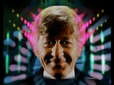
| As with the Eccleston/Tennant logo, I think it's hard to honestly judge it until we see how it looks in action. So much of any given Doctor Who logo is in the context of the animation surrounding it - Troughton's logo looks as dull as can be until it literally tears through the Doctor's face, shrouded in clouds of video feedback.
What I'm wondering, with all of these wholesale changes, is if we're going to see a change of composer. I like what Murray Gold has done, but in some respects, stylistically, he's hit the wall - the orchestra-playing-against-a-rock-beat has become the new Keff McCulloch handclaps of this era of the show. (At least in my opinion - I love Gold's music from a compositional level, but I don't see why the arrangements, more often then not, seem to eventually morph into a rock-orchestra instrumental. And this criticism is coming from someone who counts ELO as his favorite band. The first time it was genius; the fifth or eighth time, it was old hat.) |
|
| | |
CrochetOwl
RANK: Brigadier

Number of posts : 320
Registration date : 2008-01-08
| | Subject: Re: New Logo Tue Oct 06, 2009 5:36 pm | |
| Not thrilled with the logo at all. I'd rather see the Tardis not the DW lettering representing it. It messes things up. I prefer the current logo. I guess I'm getting really picky with the 2010 series (too attached to DT me thinks). With the new images popping up, I'm even thinking Amy Pond needs a bit more beef on her - too skinny (I know, I digress).
Plus, really didn't appreciate all the blocking on the DW UK sites to see the logo. Had to rely on youtube for the first image. |
|
| | |
mysterylad
RANK: Time Lord Commoner
Number of posts : 1660
Age : 52
Registration date : 2009-02-21
| | Subject: Re: New Logo Tue Oct 06, 2009 6:32 pm | |
| I just read an interesting quote from the Moff...
"Simple and beautiful, and most important of all, a completely irresistible doodle. I apologise to school notebooks everywhere, because in 2010 that's what they're going to be wearing."
He was, of course, talking about the TARDIS-shaped DW. Having read that, I get it now. Suddenly, I remember being a kid and drawing first the diamond, then the neon logos all over the place, and I am again reassured: the Moff understands this show. He understands its audience(s). And he understands why so many of us, after decades of loyal viewing in dark times, bright moments, and all shades in between, still hang on every bit of news about the new season.
I never should have doubted. |
|
| | |
sensorite
RANK: UNIT Trooper

Number of posts : 11
Registration date : 2008-11-12
| | Subject: Re: New Logo Tue Oct 06, 2009 7:15 pm | |
| I kind of like it, but just hope that the "DW" Tardis doesn't always have to be part of it. |
|
| | |
greenk9
RANK: Time Lord Commoner
Number of posts : 1313
Age : 53
Registration date : 2007-10-20
| | Subject: Re: New Logo Tue Oct 06, 2009 7:48 pm | |
| I do not mind the logo...hmmm interesting to see the bbc cattle mark under the logo...the tardis- ah a bit overkill- but it's merely o.k. I remember really loathing the eye logo with the deviant strain type style...but it did grow on me. The fire/red/orange combo really popped from across the room. The eye shape was just as recognizable as the diamond logo.
In terms of eye catching- the blue/purple combination often recedes- plus the logo floats in the air...it is not anchored into some nice form such as a diamond. Ah, I'll just let it grow on me. |
|
| | |
Evil Monkey Pope
RANK: Time Lord Council Guard

Number of posts : 2207
Registration date : 2007-07-16
| | Subject: Re: New Logo Tue Oct 06, 2009 9:07 pm | |
| I like it much better than just writing the show's name on a surfboard. |
|
| | |
jonwes
RANK: Time Lord, Gold Usher
Number of posts : 4627
Registration date : 2007-02-01
| | Subject: Re: New Logo Tue Oct 06, 2009 10:22 pm | |
| I made a big ol' blog post about it here: http://jonwesleyhuff.blogspot.com/
But to sum it up, I reservedly like it. I'm kind of waiting to see how it's applied across the various merchandise and how it looks in the credits first though. |
|
| | |
bret_owen99
RANK: Time Lord Council Guard
Number of posts : 2105
Age : 47
Registration date : 2008-04-04
| | Subject: Re: New Logo Tue Oct 06, 2009 11:03 pm | |
| wait, are we talking about the new logo, or the mcgann/pertwee logo? i can't tell the difference. |
|
| | |
Ronpur
RANK: The Doctor
Number of posts : 9626
Age : 60
Registration date : 2008-08-29
| | Subject: Re: New Logo Tue Oct 06, 2009 11:59 pm | |
| Well, from what I understand, the words Doctor Who and the W TARDIS are 2 different elements, that may or may not be used together. Sometimes the word would be the same size on one line too. I like the way it would work like that, and the logo looks a little retro to me as well. |
|
| | |
Guest
Guest
| | Subject: Re: New Logo Wed Oct 07, 2009 1:24 am | |
| Here is a ? I have. How is it going to look on widescreen tv's? My understanding was part of the reason the 'eye' logo was designed that way was so it could format better in that aspect ratio. This kinda looks like it would be ideal for the tv's from The Idiots Lantern.
By the by, I was always a fan of the Pinnacle Books logo. Bet none of ya remember that one do ya!? |
|
| | |
bret_owen99
RANK: Time Lord Council Guard
Number of posts : 2105
Age : 47
Registration date : 2008-04-04
| | Subject: Re: New Logo Wed Oct 07, 2009 5:55 am | |
| my question now is, will they change the entire title sequence to how it used to be. will cloudy-smoky-snakes swirl around to reveal an smirking image of matt smith? |
|
| | |
forbidden_moose
RANK: Brigadier
Number of posts : 370
Age : 54
Registration date : 2007-08-10
| | Subject: Re: New Logo Wed Oct 07, 2009 7:38 am | |
| - bret_owen99 wrote:
- my question now is, will they change the entire title sequence to how it used to be. will cloudy-smoky-snakes swirl around to reveal an smirking image of matt smith?
That would perhaps be the greatest continuity thing ever. they should do it in black and white |
|
| | |
Ronpur
RANK: The Doctor
Number of posts : 9626
Age : 60
Registration date : 2008-08-29
| |
| | |
| | New Logo | |
|